Classification notebook outputs
Contents
Classification notebook outputs#
Classification plots#
Plots are created using the Plotter class available in PCM_utils_forDMQC library. These plots will allow you to determine if classes show the spatial or temporal coherence you are looking for to differentiate the reference profiles.
P = pcm_utils.Plotter(ds_p, m, coords_dict= {'latitude': 'lat', 'longitude': 'long', 'time': 'dates'})
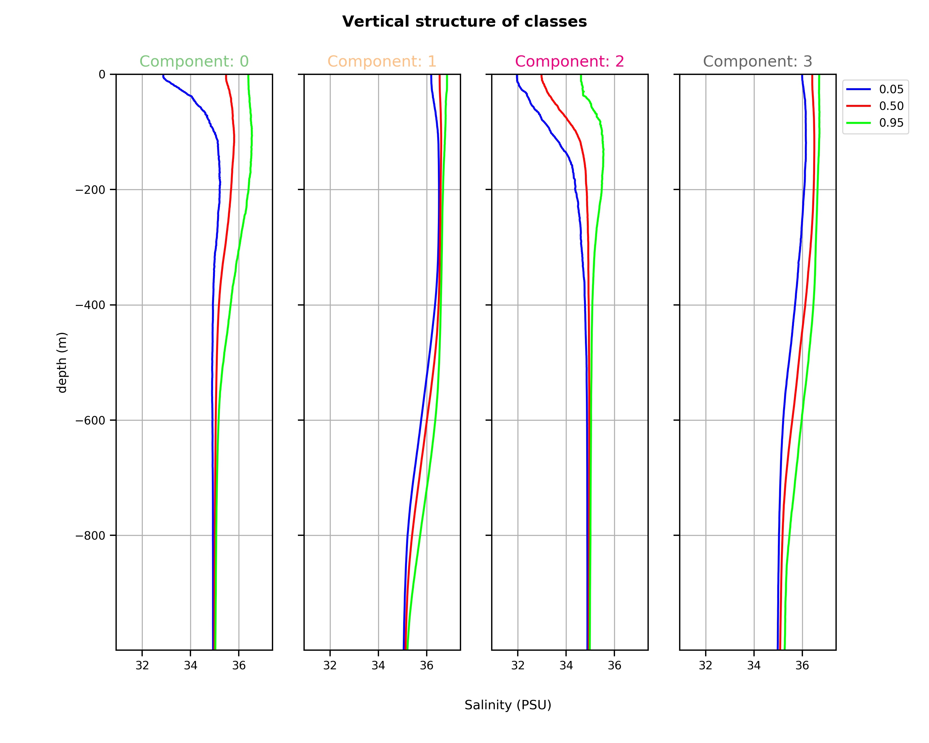
Vertical structure of classes: The graphic representation of quantile profiles reveals the vertical structure of each class. These different vertical structures are the foundation of the PCM, the “distance” of a profile to each of the typical vertical structures controls the classification outcome. The median profiles will give you the best idea of the typical profile of a class and the other quantiles, the possible spread of profiles within a class. It is with the spread that you can determine if a class has captured a homogeneous water mass (small spread) or a layer with gradients (large spread, like a thermocline for instance).
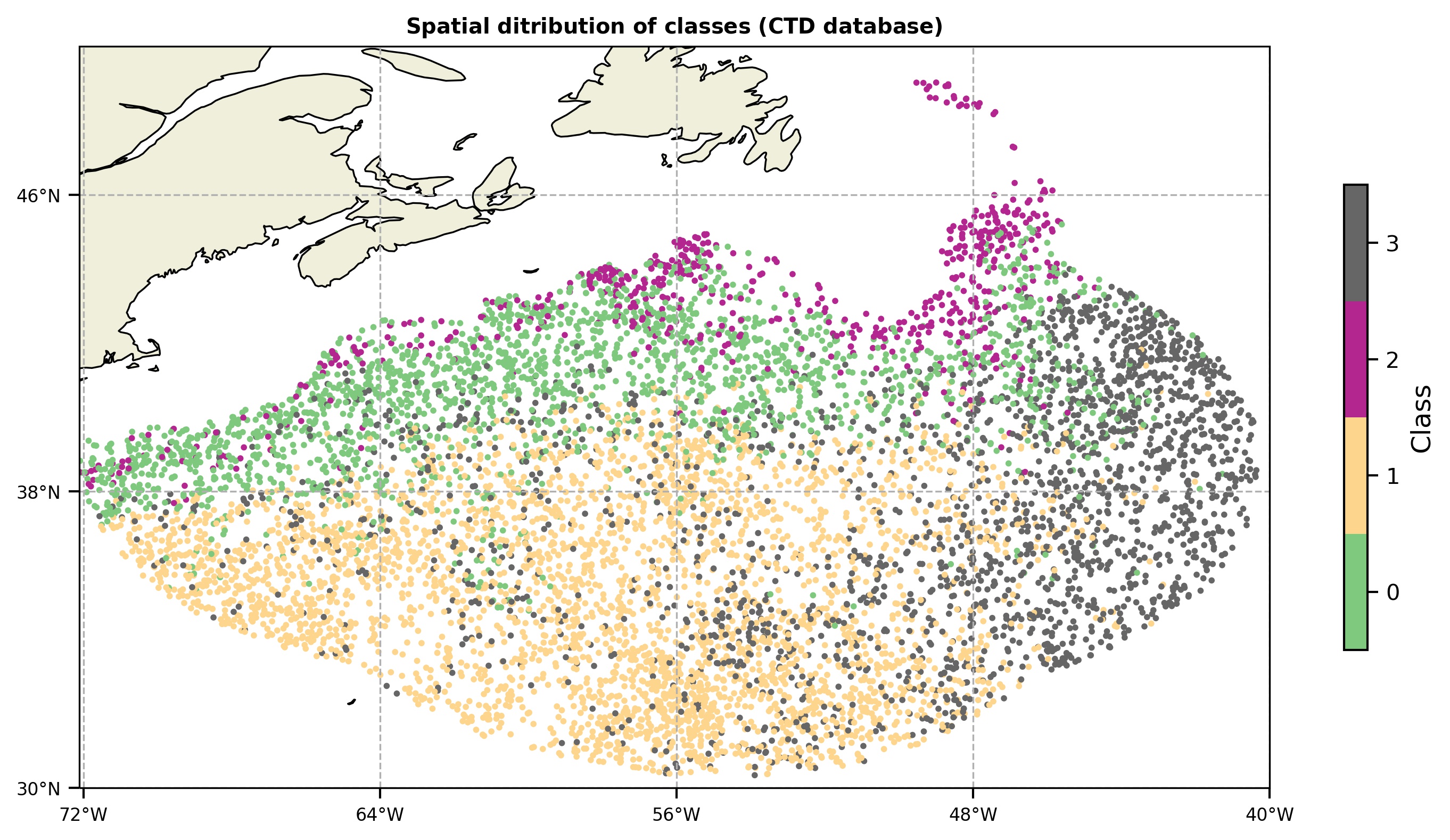
Spatial distribution of classes: You can also plot the PCM labels in a map to analyze the spatial coherence of classes. The spatial information (coordinates) of profiles is not used to fit the model, so spatial coherence appears naturally, revealing vertical structure similarities between different areas of the ocean. You can use this figure to determine if your classification is taking into account the dynamical regimes of the ocean you want to differentiate (e.g. eddies, fronts, quiescent water masses). If it is not the case, you can try with a different number of classes K.
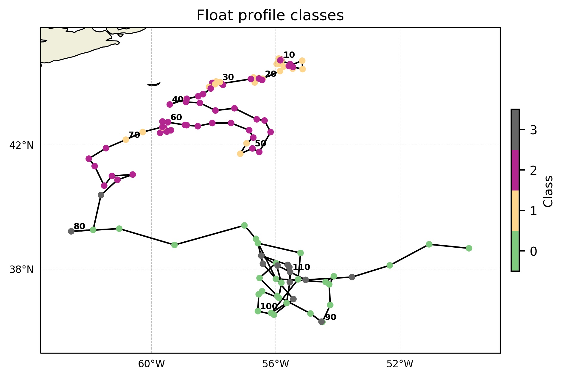
Float trajectory classes: Float profiles classes are plotted in a map.
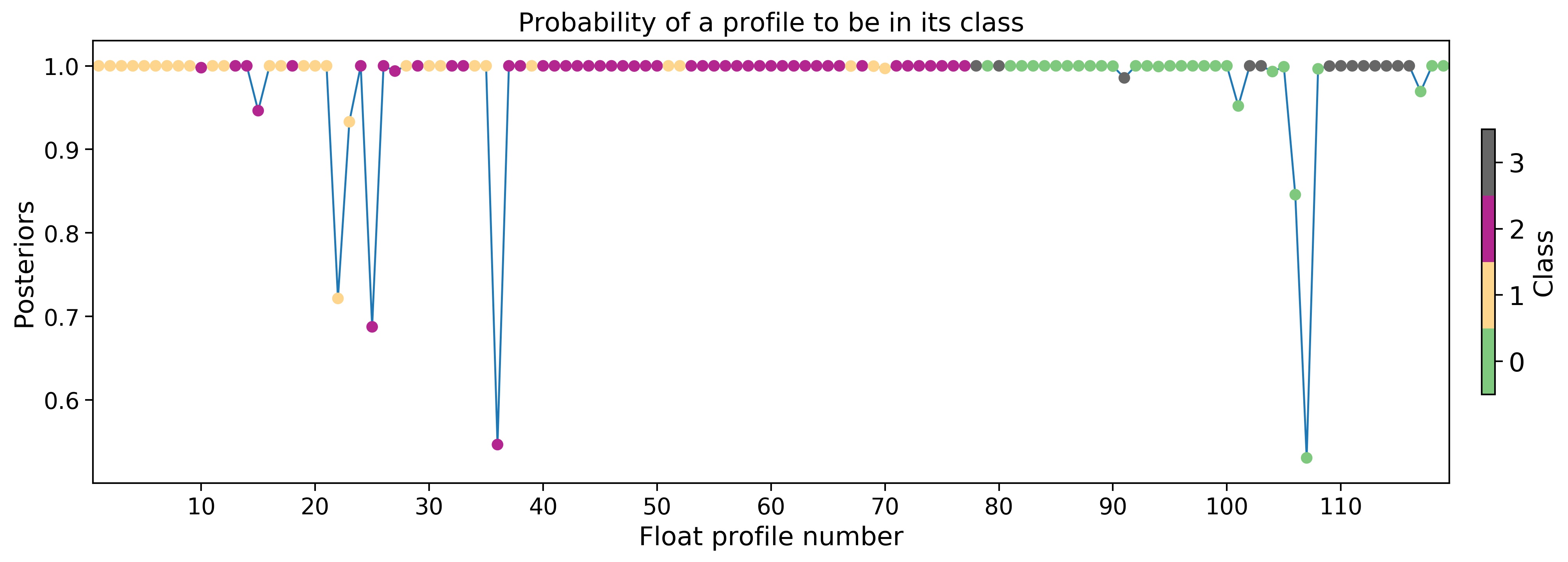
Float cycles probability: Probability of each float profile to belong to its class. Together with the robustness figure can give you an idea of the suitability of the classification in the float profiles.
Float cycles robustness: Robustness is a scaled probability of a profile to belong to a class.

Classes pie chart: pie chart showing the percentage of profiles belonging to each class and the number of classified profiles.

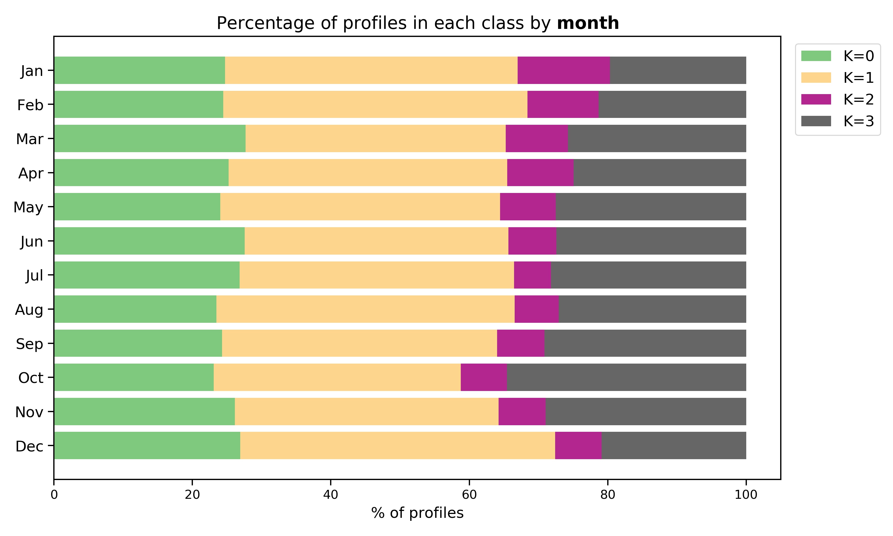
Temporal representation: A bar plot which represents the percentage of profiles in each class by month and by season. These plots can unfold underlying temporal coherence between classes: some classes can be more important in summer or in winter periods. Coherence is revealed naturally by ocean structures since time was not used to fit the PCM model.
Classes output file#
A .txt file including a list of reference profiles, their coordinates and class labels is created at the end of the notebook. This file is the input of the OWC software including the PCM option, and it allows the user to select the reference profiles in the same class as the float profile to compute the OWC calibration.
Trained model#
You have the possibility of saving the model you have just trained and use it again to predict the class labels in the same or a different dataset. This can be useful in the case of having scarce CTD data as training dataset. You can fit the model with argo data, save it and make the prediction with the CTD data. Front limits can be more accurate.